It’s true that you never get a second chance to make a first impression, and that statement applies to fundraisers, too! Every interaction between your organisation and potential donors should convey your organisation’s mission and have a clear call to action.
Why You Need a Standout Fundraiser Page
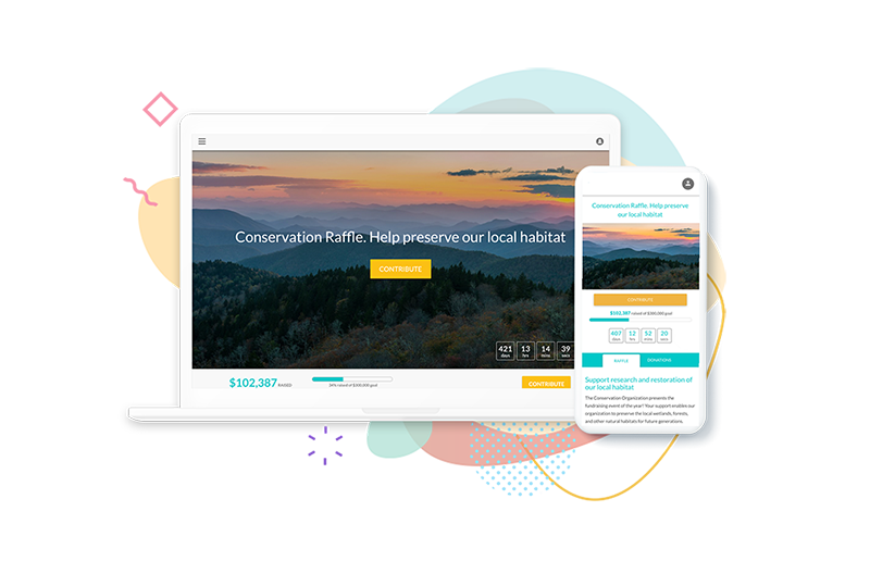
One of the most critical places to make a good impression is on your fundraiser page. Whether hosting a community bake sale, raffle, or a large charity auction, your fundraiser’s page is likely the first place people will engage with your cause.
You’ll miss out on contributions if you don’t capture their interest or make it easy to donate.
Many organisations use platforms like Facebook for fundraising, which can serve a purpose but has limitations. Consider the following:
- Not everyone uses Facebook—if someone wants to donate, they may have to log in.
- You don’t have full access to donor information or useful marketing analytics.
Facebook’s fundraising options aren’t flexible. - Your fundraiser isn’t searchable by Google or other search engines.
- There is no support. If you have a problem or a question, you cannot call anyone, and you’re unlikely to get a timely response when you send a query through their contact form.
An online fundraising platform, however, can be accessed by anyone at any time. You can personalise your page and various fundraising campaigns to represent your cause, which lends credibility, helping you to gain more support. Your fundraiser page is shareable on all social media platforms, mobile-optimised, SEO-friendly, and built for seamless donation processing. Plus, most platforms provide the data and analytics you need to optimise your fundraising efforts.
Maximising Your Online Fundraiser Page
An effective fundraiser page isn’t just about raising money—it’s about creating a space that resonates with your audience, reflects your cause, and contributes to a successful campaign.

Basics for a Great Fundraiser Page
As the first place potential donors will encounter your organisation, you want to ensure it makes a terrific impression. Here’s what you should include:
- Engaging visuals: Add your logo and include high-quality images or videos that help tell the story of your cause. Show the impact of donations in action!
- Clear information: Donors want the facts, so make them easy to find. Provide critical details about your fundraising campaign, such as donation goals, how the funds will be used, and how they can help. For instance, if you’re running an online raffle or selling tickets to a fundraising banquet, make it clear where and how people can buy tickets. More information also helps with SEO by giving search engines more content to crawl.

Consistent Branding Across All Channels
Your fundraiser page should visually align with your brand across all marketing channels. This includes social media, newsletters, and any printed materials you use to promote your fundraiser.
What is consistent branding? MailChimp’s helpful article, Establishing & Maintaining Brand Consistency defines it as ensuring that the way you present your organisation—and what it stands for—remains the same across all your marketing channels.
Consistent branding helps establish trust and recognition with your audience. Marq’s State of Brand Consistency report shows that consistency across all channels can increase revenue by 10-20%—a significant difference for your fundraiser!
That’s not small change!
As you put together your event page, take the time to add your logo, colors, and images so that it aligns visually with everything else attendees encounter. For more about event branding, review this HubSpot guide. It’s got some great examples and tips for developing your event’s brand identity.

Boosting Your Fundraiser Page with SEO
Fundraising platforms often have built-in SEO features that optimise your page for search engines. But there’s more you can do!
To drive organic traffic, use relevant keywords in your content. For instance, if you’re raising funds for a local animal shelter in Adelaide, include those specific terms in your page copy. Do a quick Google search of similar fundraisers to see which keywords top-ranking pages use, and integrate those terms into your copy.

Optimising for Mobile
Half of all web traffic comes from mobile devices, so your fundraiser page must be mobile-optimised. Make it easy for visitors to donate and learn about your cause right from their phones.
The good news is that most online fundraising platforms have mobile optimisation built right in. As a result, your page will load quickly, look great on mobile, and ensure a smooth, user-friendly experience for donors.

Leveraging Analytics for Better Results
Data is essential for maximising your fundraising efforts. With the right platform, you can track what types of donations are most popular, how donors found your page, and which marketing tactics are most effective. Use this data to inform future campaigns and adjust your strategy as needed.
Ready to Get Started?
Our charity fundraising platform simplifies donation management and provides all the tools you need to create a beautiful, effective fundraising page. Plus, our built-in marketing and reporting tools help you make data-driven decisions to boost your fundraising success. When you’re ready to launch, we’re here to help you maximise your efforts! Plus, our integrated printing services make it easy to order printed raffle tickets, flyers, and invitations, and more branded to your charity and fundraiser.


0 Comments